
Why annotated screenshots beat written feedback
Designers and product managers learned the same lesson at different times: writing UX feedback in prose is the slowest possible way to communicate it. A 200-word Slack message describing what's wrong with a layout takes the writer five minutes and the reader two — and ends with a follow-up call because the description is ambiguous. The same feedback as an annotated screenshot takes 30 seconds to produce, 5 seconds to read, and zero clarification calls.
This post is the seven moves we use most often, with examples and a quick-start workflow at the end. All of it works in Snap Markup; most of it works in any reasonably-equipped markup app, but Snap Markup's tool ordering and per-tool toolbar customization make these moves easier to chain.
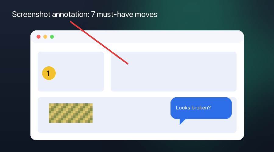
1. Arrows that point at one thing
The single biggest screenshot-feedback mistake is drawing five arrows in five colors. The reader's eye doesn't know where to land first. Use one arrow per screenshot wherever possible. If you need to point at two things, use a numbered step callout (move 3) instead of two arrows.
Make arrows long enough to start outside the element you're pointing at, so they read as "look here" rather than "this thing inside the box".
2. Mosaic any sensitive UI before sharing
Designers regularly share work-in-progress screenshots in public Slack channels, on Twitter/X, and in client emails. Customer names, real prices, internal user IDs, partner logos — all of it leaks unless you redact it. Mosaic blur with adjustable brush size is the right tool: bigger than a black box (more obvious), more secure than a simple rectangle (no edge to peek at).
If the same screenshot has multiple bystander faces (think: a designer reviewing a feed product), pair the mosaic with AI Face Blur for one-tap coverage. We covered the workflow in our AI face blur guide.
3. Numbered steps for walkthroughs
When you're explaining a flow ("first this, then this, finally this") in a single screenshot, draw numbered step callouts instead of three arrows. Snap Markup's Steps tool drops circled numbers (1, 2, 3…) with optional connector arrows between them. The reader's eye walks the path automatically.
The same convention works on screenshots of multi-page flows: number the steps across screens and stitch them into a multi-photo PDF (see move 7).
4. Speech bubbles add tone
Sometimes feedback is "this card looks broken — am I missing data?" Sometimes it's "this card looks broken — please fix". A short speech bubble next to the element conveys the question vs. directive distinction better than a written caption can. Snap Markup's 10 bubble styles include round, sharp, thought-cloud, and shout-burst — pick one that matches your tone.
Tip: keep speech bubbles to ~6 words. Longer than that and you're back to writing prose.
5. Color hierarchy: red, yellow, blue
Pick three colors and stick to them across an annotation set. Our default:
- Red for "this is broken" or "must fix"
- Yellow for "consider this" or "minor improvement"
- Blue for neutral pointers, captions, and step numbers
The reader scans red first, yellow second, blue third — automatically. No legend required.
6. Before/after composites
For visual fixes — typography changes, spacing tweaks, color adjustments — annotated screenshots only get you halfway. The other half is a side-by-side composite. Use Snap Markup's Photo Sticker tool to drop your proposed mockup on top of (or next to) the current screenshot. Adjust opacity to fade between them, or arrange them edge-to-edge.
7. Multi-photo PDFs for design reviews
Single screenshots work for tickets and Slack. Whole design reviews — across 8–20 screens of an in-progress feature — work better as one PDF. Use Snap Markup's Generate PDF flow (Home → floating + → Generate PDF) to bundle every annotated screenshot into a numbered, password-protected document. Read our multi-photo PDF guide for the step-by-step.
Bonus: PDF reviews are easier to skim than 20 separate screenshots in Slack, and they archive better — your future self thanks you when revisiting old design decisions.
Quick-start: build an annotation toolbar that fits your workflow
Snap Markup ships 21 editing tools, but you don't need all 21 in your bottom toolbar. Customize the order so your most-used annotation primitives are one tap away:
- Open Settings → Edit → Tool Order.
- Toggle off any tools you never use (Stamp, Measurement, etc., depending on your work).
- Drag the remaining tools into your preferred order. Our designer-friendly default: Draw, Text, Steps, Bubble, Mosaic, Photo Sticker.
- Reload the editor. Your custom toolbar persists across sessions.
Free on Android, premium on iOS
Snap Markup is free on Google Play and a one-time purchase on the Apple App Store. No subscription, no ads inside the editor, no signup. Download from the App Store or Google Play, then read our comparison of the top 10 markup apps to see why we built it the way we did.